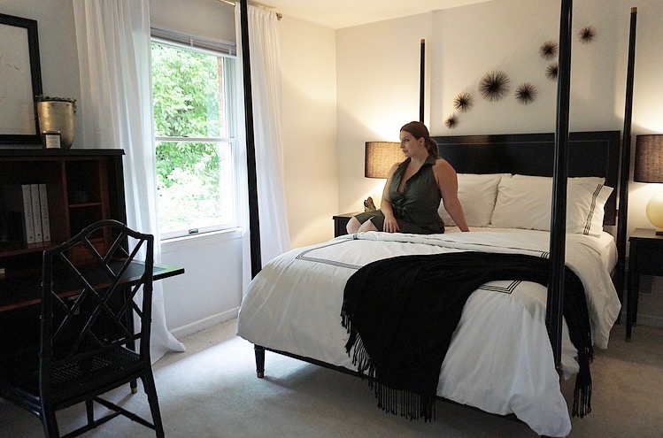
For the four years we’ve been in our home, the guest room has gone under a few transitions. First, outfitted with a desk and nightstands I bought from Target for my first apartment, then, when my mom moved in, with a giant recliner, a kitchenette, and her furniture from the farm. When she passed, we sold everything, taking the room back down to a blank canvas that stayed empty for a few weeks. Thinking of what sort of furniture would work with our home, what would make our guests feel like they’ve found a quiet respite, brainstorming art, accessories, a soft palette led me to images of hotel suites and clean rooms in a black and white scheme…
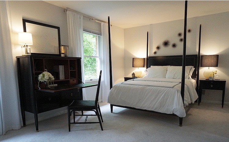
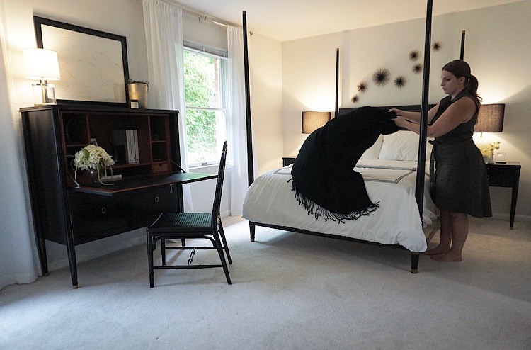
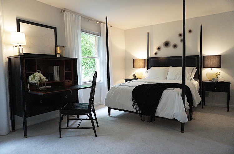
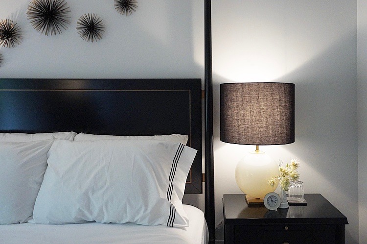
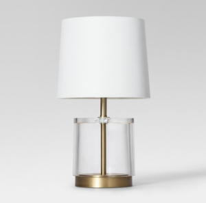
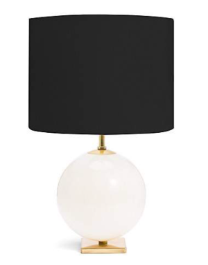
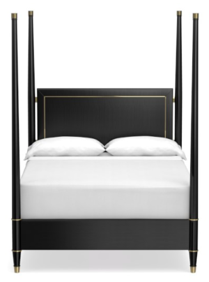
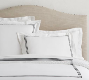
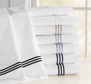
I mentioned my love of the clean lines of Williams-Sonoma’s Lacourte collection several months ago, and you recently received a preview of the furniture pieces in this post. I wasn’t aware of just how beautiful the furniture would look in our space, though, until it was pared with the soft and hotel-like linens from Pottery Barn’s Grand bedding and the fun yet sophisticated Elsie lamps from Kate Spade’s home collection.
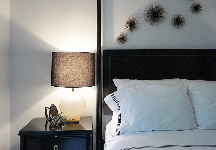
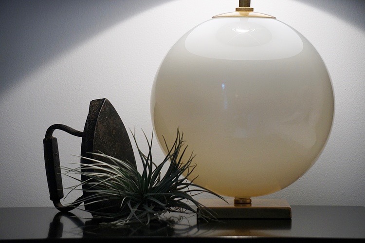
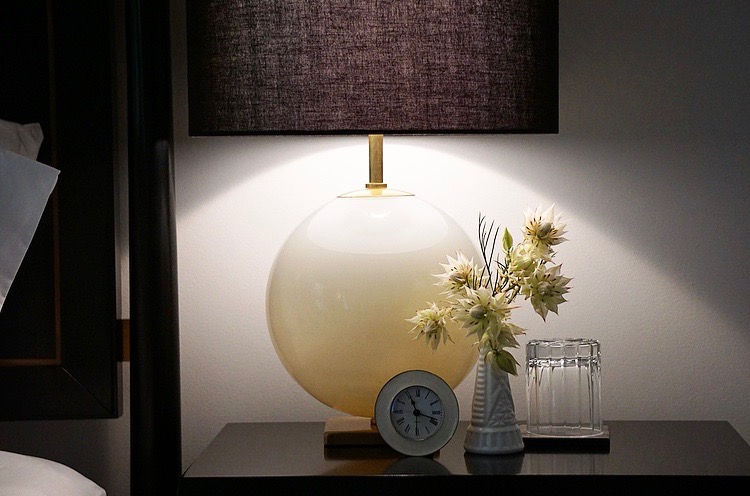
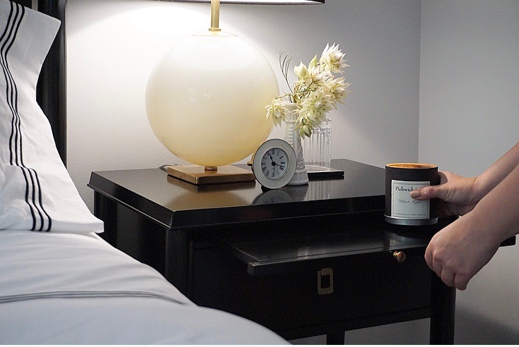
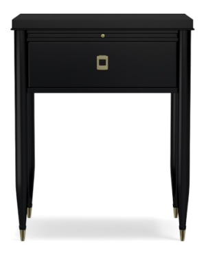
I love a nice, clear space on end tables, opting for minimal accessories. Here, I’ve paired one of my airplants with my great-grandmother’s iron. Opposite, fresh flowers (the prettiest Blushing Bride Protea), an enamel clock (from Z Gallerie, several years ago, no longer available), and a tumbler provide something beautiful and something functional for any houseguests. Lending a nod to function and space-saving ability, the Lacourte end tables offer a pull-out shelf for extra space for notes, a book, or the Black Pepper candle from Pickwick and Co.
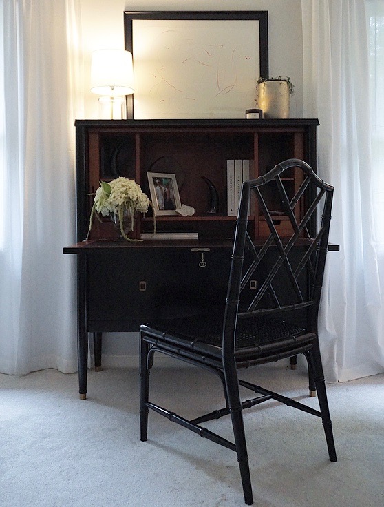
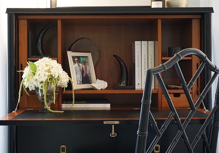
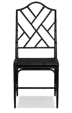
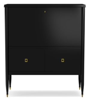
On the larger wall, between two sunny, West-facing windows, the upright desk opens to reveal a wood and leather interior, perfect for storing books to peruse, family photos, and drawers for Louisville-centered postcards. A chippendale-style chair looks breezy, and makes me think of vacationing- perfect for folks who’ve stopped in for a getaway.
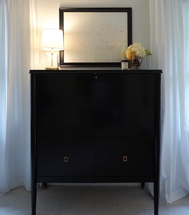
I’m hoping our guest room now feels like a real place to stop and relax. While there are still a few changes I’m hoping to make- maybe bringing in a slightly warmer wall color and replacing our poopy Target curtains with something that has a blackout liner and a nice border- it finally feels finished in here, and- perhaps more importantly- finally feels like a room that belongs with the rest of our home. Let me know when you’d like to stay a bit.
** this post was not sponsored in any way. all thoughts and opinions are my own **
** photos by Kyle Lueken **
Shop the Room


Gorgeous as always! Love the simplicity of your decorating!
Thanks, Marilyn!