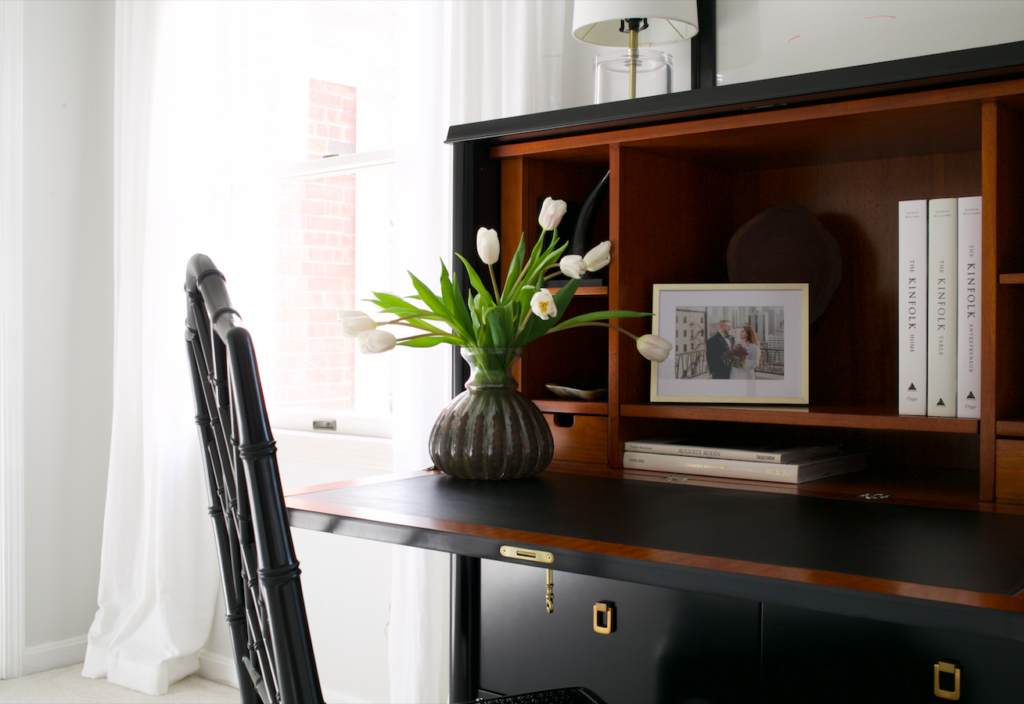
I know I share so many glimpses of our house between here and on Instagram, and truth be told, I’ve never been inclined to share the whole thing because there’s never really been a time that it was all “done.” And, it’s still not “done!” But, with my newly wedded monogram making an appearance, the kitchen complete (save for a black and brass stove that I may someday have installed), and the master bath finally- finally!- rid of the icky cherub wallpaper, I feel like I’m ready for you to see the whole place at once… almost.
We still have items on the to-do list. The guest bath needs a major renovation, and we haven’t even started on the basement. Eventually, new window treatments will go everywhere they aren’t now, and the powder room on the main floor will get a little facelift (new wallpaper, lighting, and fixtures)… But, it’s home. After 6 years of being here, we’re finally pretty close to perfect, and it’s time to show off.
I share this with you for a couple of reasons. Firstly, I’m proud of where we live. It’s beautiful, it’s quiet and calm. The walls just beg for quiet jazz from a hidden Sonos speaker, and there’s almost always the smell of coffee and flowers or the Bibliotheque room spray from Byredo. But, more importantly, this little house did not always appear the way it does now. and that is the important thing.
When we bought our little place, there were no curtains. The walls everywhere were butter yellow other than in the kitchen where they were bright red. The cherub wallpaper was here. Original 1983 carpet was throughout. But- she had promise.
One of my biggest weaknesses as a Realtor is that I walk into a house and immediately see the potential good. You may think that’s not a weakness, but trust me, it is. Just as pessimism and glass-half-emptyness can completely skew one’s vision of what’s real, so can an eternally-worn pair of rose-colored glasses. I fall in love with almost every listing I walk into- seeing what a dining room could look like with new wallpaper or better lighting, or knowing that the kitchen could really be a showstopper if the old cabinets and soffits come out. It’s what I did here. When we walked in in late 2013, I knew that this place could be really, really special. It had the space and the location we wanted… we just had to make her pretty, and I think we succeeded.

So, introducing, a new tab, “Our Home.” Found at the top of the blog, this little button is a quick way to see our place in all of it’s current glory. For a shortcut, click here.
What I always hope I can impress upon you, dear readers is this: 85% perfect is good enough in a home. Look for area and space (or possibility of additional space!) and structure. Paint can be covered, floors can be refinished, and bathrooms can be made over. And, generally speaking, none of this has to be done immediately. Take the time to decide what your home needs to look like and feel like, and make it a project that takes a little time and doesn’t break the bank. I hope that you’ll find yourself as happy in your home as I am in mine.
** this post is not sponsored in any way. all thoughts and opinions are my own **
** photos via Don Lehman **
